The title is a bit of a mood kill, but moving on.
The company's called Ak Bhar Cha Productions (translated into English it means One Cup of Tea productions, but bhar is more like an earthen cup, from which Bengalis sip tea at a leisurely pace discussing the events of the world and their neighbour's cat - also known as adda - the activity, not the cat...although that would be a nice name). Now Ak Bhar Cha wants to do this film fest thing, but being primarily Bengalis they don't just want any goddamn film fest - but something with a little more quirk. So they make Ulto Reel (Ulto = Opposite/Topsy of the Turvy fame) which is basically a whole mashup of indie flicks, LGBT films, art house cinema etc. Nothing commercial, mostly pretentious. You get? Anyway, the cause is noble and the films are actually pretty damn good so let's get this prettied up.
For the posters, I stuck to the format I'm currently crushing on. Bright colours, fonts of varying sizes. Minimal, with just the right amount of information. For further details, you'll have to log onto the website. Fonts from the Helvetica family and I've tried different coloured backgrounds.


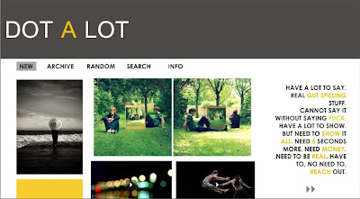
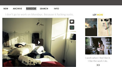
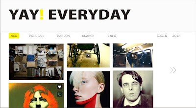
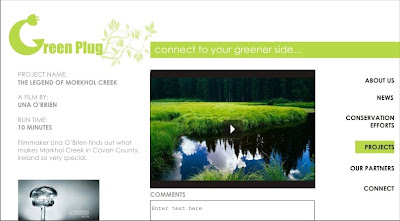
 I wasn't sure if I should have continued with the bright colours for the site, but this is what I finally decided on. Neat and minimal, with a few accents of bright colour. The reason being, there's a lot of material on the site and the more sober the colours, the easier to stare at the screen for longer periods of time. It's a detailed website with the event itinerary, trailers and summaries from the films being screened, categories of cinema being screened, director profiles - all the scoop basically. Ak Bhar Cha wanted to cut down on printing costs and also be environmentally friendly. So sorry, no catalogues, only cyber memorabilia.
  Oh but what is branding without something to take home and remember you by? So we have passes, designed in the same vein as the posters. You can use these unusually shaped passes as coasters after the event. Or just stick it up on your softboard. The front is simple enough - event name, date, event logo, company logo. The back is an idea that may or may not be incorporated - but it works for people like me who are too lazy to go through the fine print. It has all the event highlights of the day, telling you how you could plan your day. Oh, but FYI, none of the films in competition are promoted. That would be unfair.
 So for that we have the schedule sheet a.k.a. Event Itinerary. It has the entire list of events listed according to time and date (which I haven't done, because obviously this is all make believe and even if I have a lot of time to kill, it would be ridiculous to make up a 4 day long film schedule for a non-existent event and non-existent company).


 Obviously not very refined - the edges are a little meh - but I couldn't help the haste. Have fun!


