Tuesday, November 2, 2010

Secrets


So, this is a little complicated, because I certainly don't want to put up my secrets online. So I made some up and some are just random not so secret secrets. I'm sure you know this is inspired by the utterly voyeuristic, but totally addictive www.postsecret.com


Story - Shut up - Kiss - courtesy SoodooSen.


Friday, September 10, 2010

Posters

So I've not had much to do of late apart from waiting, waiting and waiting for this stupid commercial to take off. So I busied myself with some poster designs for an imaginary orgnaisation called BRAINSPILL. They don't really mean anything, but I'm bored, humor me. I want to play some more with the fonts. Then, I'll work on the cleverness. For now though - tada! I like the idea of really bold solid colours with illustrations and heavy fonts (I've used Kilogram and Xirod).


Thursday, July 22, 2010

Round Labels

Click on Image to Enlarge

There's this site I absolutely adore (thanks Suk!) called The Die Line which has these really cool package designs. Was playing around a bit, having downloaded a whole bunch of cute fonts, and got me some inspiration from DL.
Green Leaf (Mint) - is one of those fancy dried herb thingies in those squat, transparent glass jars with corks.
Royal Riviera - is just some boring, random wine
The guy with mouth - is not really a label, but a lid for a steaming hot coffee cup
Spice (Cinnamon) - is like green leaf
Pure Juice - is a peel off label-lid
Fishy - is fish food - the little dots are the holes
Swiss Mints - are well, little coin shaped Swiss mint chocolates, also in jars with a porcelain stopper
Blue Glue etc - are peel off jello label-lids
Have some more ideas, but very little time. This is fun but.


Wednesday, June 30, 2010

A-Peel

So here's something fun I discovered online. It's called the Peeled Effect and it's lots of fun. Try it. Had some fun with this dude here and the second picture is self explanatory :)

Obviously not very refined - the edges are a little meh - but I couldn't help the haste. Have fun!

Saturday, June 26, 2010

Project Save a Picture

So I stumbled upon a fabulous picture on Yay, which said: Take an ordinary photograph, apply a vintage effect and write something in Helvetica (click to see it)- or something to that extent. True. Very, very true. The effect, if used cleverly can be superb. So I fished around for some very meh pictures in my folders and decided to go give it a go. Surprisingly, I have no digital stills of Victoria - so this one I found online and worked upon (Click on the original image). The rest are a motley collection of mediocre pictures I clicked in and around Cal. The text is bogus, so don't bother. Hehe. So, does it work for you?


I didn't want an extremely over processed look - but you know just enough for a touch of drama and warmth. Personally, I think the rickshaw picture turned out the best - and oh, I suddenly love photoshop all over again :)
This one (in Cherapunjee, Shillong) I did a little while back. The original is a little dark, and hardly represents the magic of the moment.


Saturday, June 19, 2010

Bookish

Judge a book by its cover. Here are a few.


The last two are like an homage. The first one is like those 1960s Penguin Classics and the last one is a pulp fiction, horror.

Friday, June 18, 2010

Webby


I love visiting cool looking websites. And of late I've started to develop a soft corner for simple, clean designs. Not too heavy on the flash and interactive stuff. Stark, minimal stuff.
So I was fooling around with Corel and came up with some ideas. They are mostly meant for small businesses. Like this one here, is kind of inspired by YAY!Everyday - a website I absolutely adore. In fact, I liked their layout so much that, I wanted to replicate it - so I started
with that. Then Dot A Lot happened.
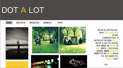
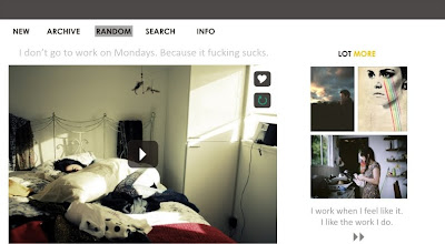
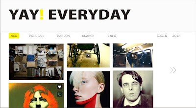
(This one's a dummy page that I created - for the real thing visit their website)

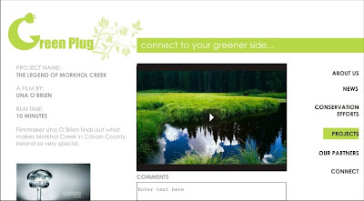
Green Plug was a logo I created a while back. So played around with a design for that:


I'm not so sure I like it much - but yeah, the idea is again very low key, minimal.

But enough with minimal. Let's get campy. So Joey's Garage & Toolshed happened. Not campy really - but you know what I mean. It could be a pop up ad, if not a full fledged website. The ad on the left hand corner is Trojan's. :)
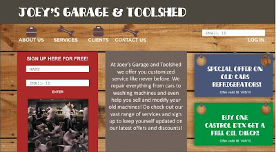

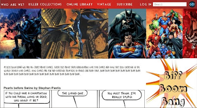
Here's a hybrid between the colourful and the classic.

And this one's for the comic lovers.

Working on more - as and when inspiration strikes. But hey, if you have a small business and are looking for template ideas, drop me a line :)